


The kitchen is the heart of the home, and even if I’m no cook, I am excellent at opening a bottle or red and putting the world to rights at our kitchen island! As in most homes, it’s the one room where we congregate as a family and where we entertain our guests.
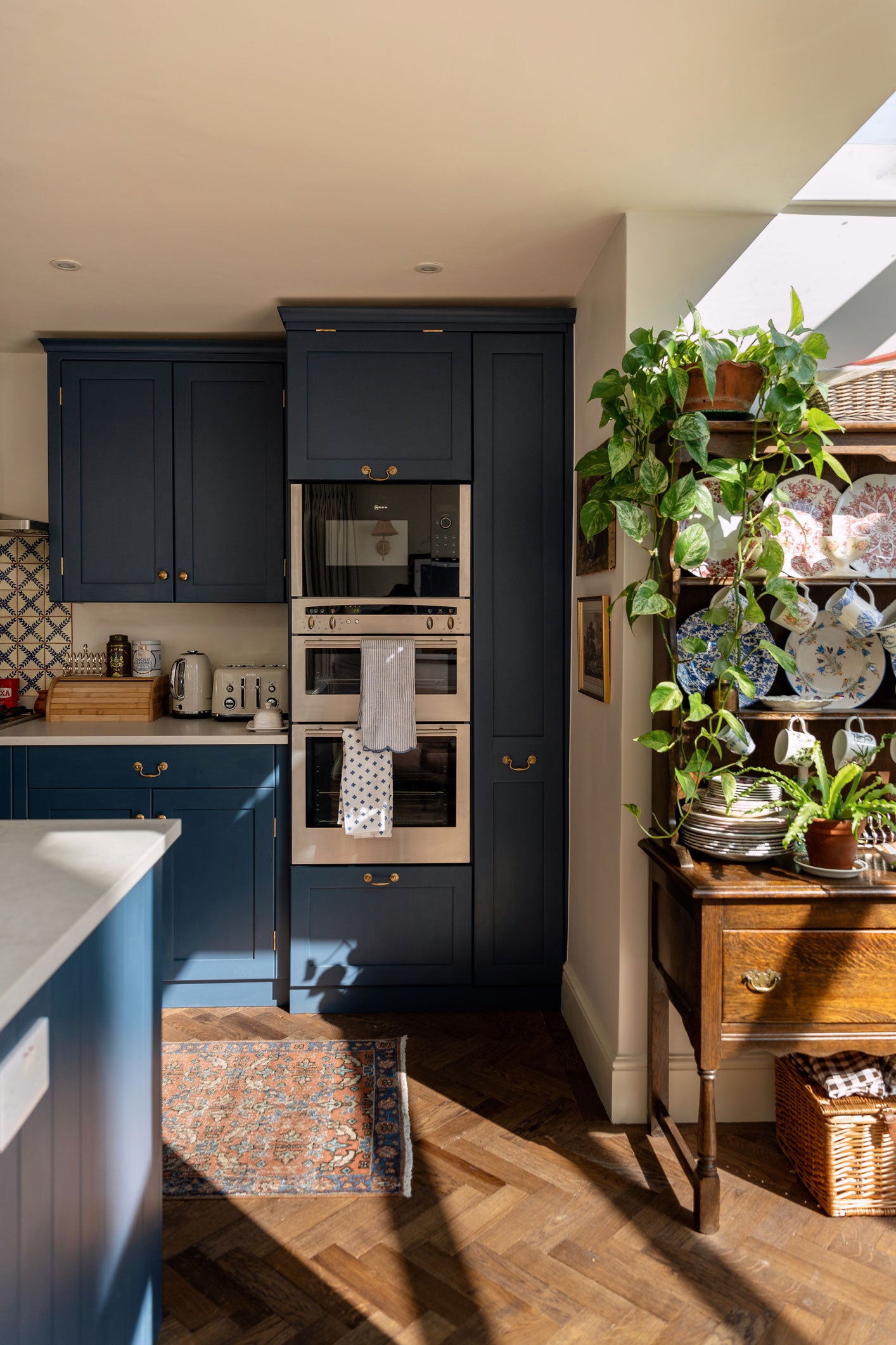
I wanted to keep some of the farmhouse feel that we had in the old home but adapt it to suit our new city setting. The kitchen cupboards we inherited were in good condition, so we decided to keep them, giving them a new coat of paint and updating the hardware. British Standard make a similar shaker style of cabinet, so we added those into our new island, which really brought the space together. The dark blue is Carbon by Fired Earth - a colour I’d seen Pinterest and tracked down. The floors are actually new, but look old. The wood is tumbled, and laid in a parquet pattern - we chose Ebony Oak Aged Parquet flooring from The Natural Wood Floor Company. The walls were kept neutral in Slaked Lime Midi by The Little Greene Paint Co. We went for quartz countertops, the same we had in the countryside, and even in LA before that! I really rate the Honed London Grey from Caesarstone
I’m thrilled with the kitchen result; it also meant we didn’t waste anything by ripping out a whole kitchen and re-doing it when we didn’t need to.
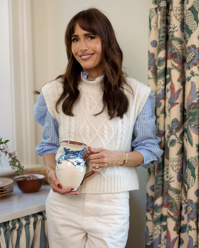
So back to our island. You might remember the debate from doing up the old house: is there space for one or is there not? We went for it in the end and even though it was a slim one, we realised how much they’re used. So here in London, our island is pretty large. It’s a space to chatter, have drinks and perch with a coffee during the day, especially on lovely Oka bar stools that I had upholstered in a signature brown fabric from Sharland England, my new homewares collection.
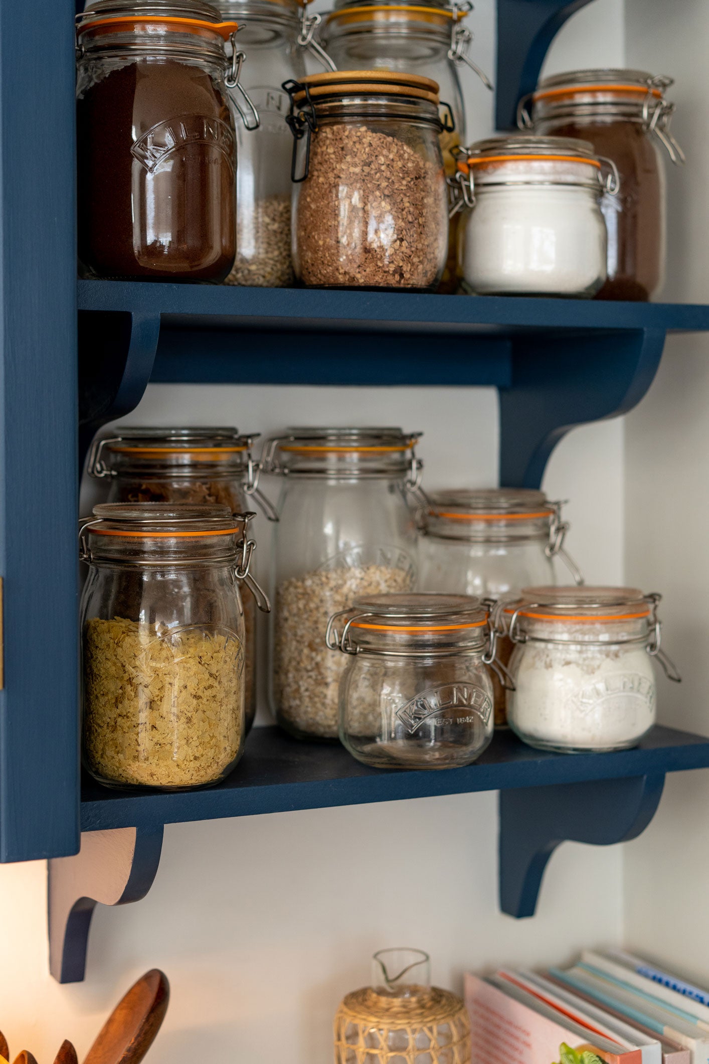
Once I had my blue joinery in place, the colour scheme came together easily. I found some beautiful Milagros blue and white tiles that were hand-painted in Mexico. I used terracotta grouting, which makes a huge difference aesthetically: to me, it makes the whole vibe feel warmer, older and more authentic. The colour is also picked up in the floor runner, which I found on Etsy. The shelves either side of the cabinets are a mix of glass Kilner jars and colourful jugs that I’ve collected over time. The pink splatter jug is from Hot Pottery; the floral blue one is Burleigh and the teapot is Royal Copenhagen. Above is another splatter jug, a Tory Burch version in blue, as well as a black floral design by Ralph Lauren Home and a terracotta one by Casa Cubista on Notonthehighstreet.
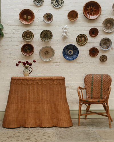
After displaying these alongside my collection of blue and white plates on the Welsh dresser, I added some brown clam plates that I found from France via Ebay and some terracotta cups from Notonthehighstreet that I’ve dotted around the kitchen. The brown, blue and cream theme was complete. There’s a little more colour added to the room with plants on the dresser and my 'Hadley' tray from Sharland England too.
Lighting-wise, I knew what I wanted the overall look to be prior to work beginning. I already had one beautiful pendant light by Alice Palmer that we’d had in the Orangery so I got another to match and hung both of them over the island. The blue and white fabric shades are a lovely way to soften the hard edges of a kitchen. There are downlighters under the cabinets which gives the kitchen a low-lit glow in the evening. To me, a great kitchen is one that is bright and open during the day but cosy in the evenings.
Attached to the kitchen is a little dining area. Our lovely pink Loaf sofa that we had in the Orangery was brought in here, alongside the same dining table. Under the dining table is a sisal rug I’d literally had for years, wrapped up in the garage in LA, but never had the right place to use. I knew I’d find the perfect place for it one day! The lamp is an old Oka friend- I don’t think I’ve ever had a lamp that looks so good in as many different places.
As with every room in the house, I’m going to play around with the art until I find the look I like the most…and then will probably switch it again. There are lots of antique etchings, and a couple of oil paintings from EBay that I removed the frames from. The Gray Malin print behind the sofa started out above our bed in LA; it was in Honor’s nursery before finding its home here.
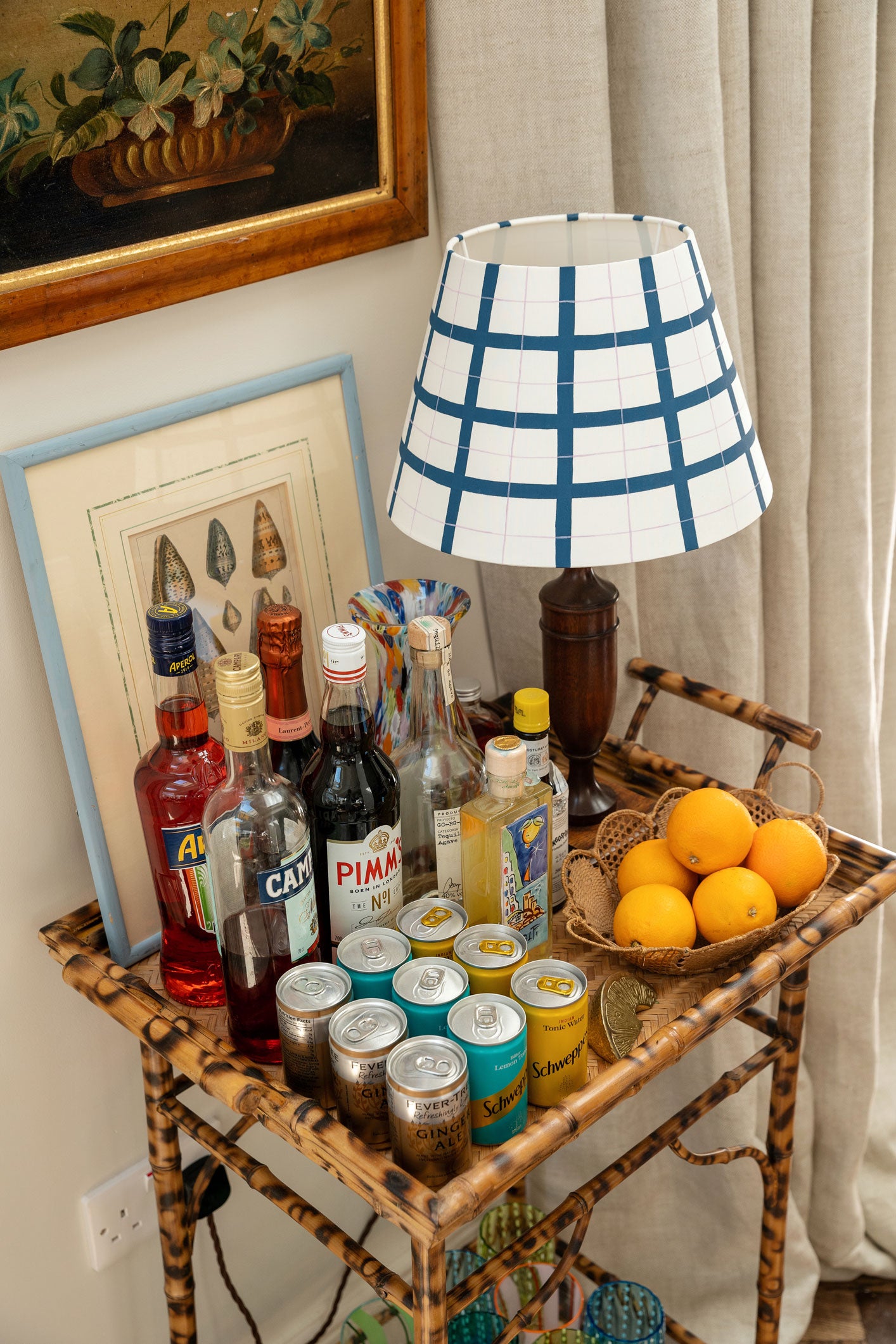
Speaking of, I think this is one of my favourite pieces in the kitchen. The bamboo bar cart itself is an antique from Lou & Pickle with a colourful carafe by Rebecca Udall and the green and blue glasses by Bias Editions. There’s a lovely shell picture on the tray by Domenica Marland and I think it adds to the whole beach cocktail vibe that we’ve got going on.
So there it is. A little cocktail stop at the beach bar before a cosy kitchen supper (thank you chef) and a debrief of the day.


Get Inspired With Louise's Roomscapes

