Readers of my blog will know that I’m obsessed with interior design (even more than fashion lately!), but this particular design project was more special than anything else we’ve done at home so far: our baby girl’s nursery. Maybe I’m just hormonal, but this adorable space turned out so sweet that it brought me to tears when finished.
Mackenzie and I were keen that the space wasn’t too ‘babyish’ – it was important to keep it elegant and in keeping with the rest of the house too. I adore a very English country feel, having grown up there; plus our house here in LA was built in the 1930’s, so it lends itself well to antique furniture and traditional prints.
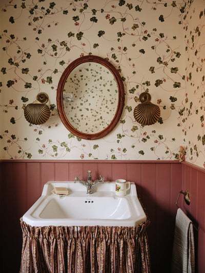
First up, I went for wallpaper. I think it gives a room such depth. Chintz was top of my list, and is making a major comeback! I found the perfect pattern by my friend Nathan Turner. As soon as I laid eyes on it, I stopped looking at anything else.
Knowing we were having a daughter, I opted for a feminine color palette. Instead of traditional pinks, I took the green and peach from the wallpaper and ran with it. I found a storage basket from Serena & Lily, woven with a hint of seafoam, which is a great way to hide diapers!
I worked with Jessica McCarthy from the design firm Decorist, who whipped up a mood board from my notes, and began suggesting retailers and products for the space. Decorist does all correspondence between designer and client online, and is a really cost-effective way to work with a designer. Jessica’s advice has been super helpful in putting the space together – as a nursery isn’t just about aesthetics but a very practical array of items, and where they need to be placed, which is all new to us!
Jessica suggested layering a vintage rug over a sisal one, and she sourced the neutral rug from Bed Bath & Beyond, and I found the vintage one all the way in Turkey on Etsy! I love bringing unexpected things together and seeing how they work. The antique chest and side table from Viyet really brought the whole space to life – complemented by 1920’s encyclopedia prints, which were another unexpected twist! I love how they look very chic and grown up, but are actually educational for children too. To pick up on the warmth of the gold frames, Jessica found a mirror and standing lamp in similar hues.
One day when my Mum was visiting from England, we stumbled into Pottery Barn Kids, and fell in love with a crib, chair, and bedding. I couldn’t resist the lamb mobile, which Mackenzie has just finished hanging! The chair rocks and reclines, perfect for nursing in the middle of the night, and we got to choose an exact, custom fabric that would match the curtains, which we got from Loom. The ‘cot’ – as we call them in England, also turns into a toddler bed in a few years, which is handy. To keep everything neutral (I didn’t want anything bright), I chose simple, white quilted bed linen, which looks gorgeous.
Lastly, I’m a bookworm, and grew up with traditional children’s literature like Peter Rabbit. So I couldn’t resist buying the full Beatrix Potter collection, to store on a marble shelf. Hopefully the ‘nursing corner’ will one day become our little girl’s ‘reading corner’ instead!


